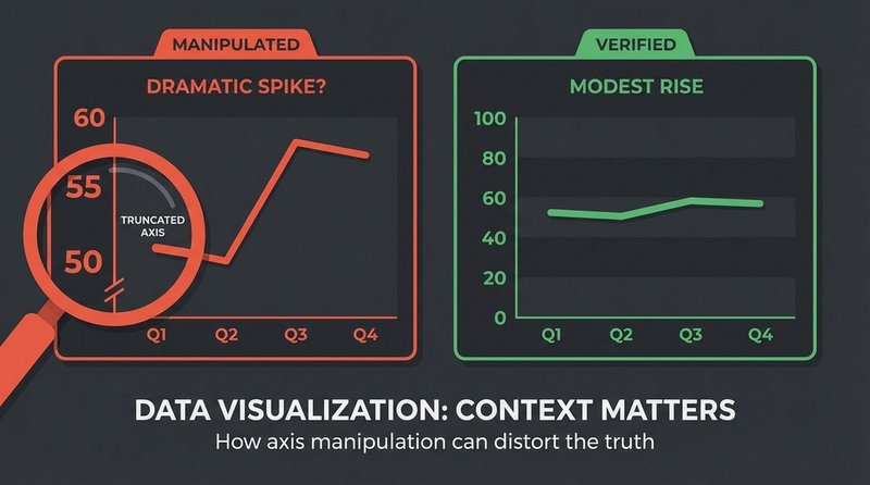
Every data point in the graph was real. The Bureau of Labor Statistics numbers were accurate. Yet the chart was designed to deceive — through a truncated Y-axis, a carefully selected start date, and the complete omission of international comparison. This is how statistical manipulation works at its most sophisticated.
The Claim
Starting in late 2022, a graph showing U.S. inflation data circulated widely on social media with captions claiming it proved that inflation had “skyrocketed out of control” under the sitting administration — implying unique political mismanagement. The chart appeared across partisan news sites, Twitter/X, and Facebook, accumulating millions of shares. No fabricated numbers were involved. The manipulation was entirely visual and contextual.
How It Spread
The graph’s design included three classic manipulation techniques. First, the Y-axis started at approximately 6% rather than 0%, making a move from 7% to 9% appear as a near-vertical spike when it represented a 2-percentage-point change. Second, the timeframe began precisely at a low-inflation baseline, maximizing the visual appearance of rise. Third, no comparable inflation data from other countries — the EU, UK, Canada — was included, obscuring that the same period saw inflation spikes globally, driven by post-pandemic supply chain disruption and energy price shocks.
PolitiFact rated multiple versions of this claim as “Mostly False,” noting that the underlying Bureau of Labor Statistics (BLS) data was accurate but the presentation was structured to mislead. A Pew Research Center study on data visualization literacy found that truncated axes are the single most common technique used to manipulate perception of accurate data.
The Truth
U.S. inflation did rise significantly in 2021–2022, peaking at 9.1% in June 2022 — the highest rate since 1981. This is a real economic fact. However, the same period saw inflation peak at 10.1% in the UK, 10.6% in Germany, and 10.6% across the eurozone, according to respective national statistics offices. The global driver was a combination of post-COVID demand recovery, energy price volatility following the Russian invasion of Ukraine, and supply chain normalization delays — none of which are attributable to a single national government’s policy choices.
How to Spot It
- Check where the Y-axis starts: if it begins above zero, the visual slope is exaggerated. Redraw the graph mentally from zero to assess the actual magnitude of change.
- Ask what the timeframe excludes: a graph starting at a convenient low point and ending at a convenient high point is cherry-picking. What happened before? What happened after?
- Demand international comparison for macroeconomic claims: if the same trend appears in 30 countries simultaneously, attributing it to one government’s policy is logically incoherent.
- Find the original data source — BLS, Eurostat, OECD — and build your own chart from scratch. If your chart looks different from the viral one, the viral one was manipulated.
Classification
This case is classified as visual statistical manipulation / out-of-context data framing. It represents a particularly effective category of misinformation because the underlying facts are real and checkable — which provides plausible deniability for producers of the misleading version. The Pew Research Center’s work on data visualization literacy specifically identified this pattern as one of the hardest for general audiences to detect without training, because the instinct to “check the data” doesn’t catch manipulation that occurs in how the data is displayed rather than in the data itself.